Friday, February 25, 2011

#105: Spartacus

Spartacus, 1960, directed by Stanley Kubrick, screenplay by Dalton Trumbo, from the novel by Howard Fast

When most actors discover they didn't get a role they wanted, they react like you or I would: by driving to Las Vegas and spending the rent money on blackjack and cocaine. But Kirk Douglas was never most actors. So when William Wyler gave the role of Ben Hur to Charlton Heston, Douglas decided he'd make his own sand and sandals epic, better than Ben Hur, staring himself and not Charlton Heston, and who wants to work with William Wyler anyway? For his subject, Douglas chose Howard Fast's fictionalized version of the Third Servile War, Spartacus. Perhaps Douglas recognized a kindred spirit in Fast, who, on finding himself blacklisted from publishing because of his refusal to testify before the House Committee on Un-American Activities, published Spartacus himself. Like most projects started to compensate for rejection, Spartacus is self-consciously designed to proclaim its own greatness in every possible way. But it was made during the golden age of Hollywood epics, when the bar for films proclaiming their own greatness was very high indeed; Cleopatra wouldn't spoil everyone's fun for another three years. So how did Douglas signify to audiences that they were watching an epic?

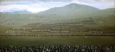
Start with the film stock. Part of the point of epic filmmaking is to make something that television can't possibly compete with, which means an very wide aspect ratio, projected on gigantic screens. Masked 35mm is the cheapest and easiest way to get the aspect ratio, but you're not even using the entire 35mm frame, so it gets grainy if you project it on too big a screen. Anamorphic 35mm uses the full frame and looks better—that's what widescreen filmmakers normally use today—but it's still not as sharp as you want if you're going to project it onto screens the size of small towns. So you've gotta go higher resolution, which usually means 65mm stock. Ben Hur—the production Douglas saw as his direct competition—was shot using a process called MGM Camera 65, which not only used a 65mm negative but an anamorphic lens on top of that, and produced what is probably the widest aspect ratio in commercial features: a 2.76:1 image. But 65mm film stock is ridiculously expensive, so Spartacus was shot using a different process called Super Technirama 70. Despite the name, Super Technirama doesn't require 65mm film stock. Instead, standard 35mm was run through the camera sideways, allowing for a wider aspect ratio that could still produce a good-looking 70mm print.1 Which is to say, a print where shots like this look like an army, not a failed experiment in Pointillism.

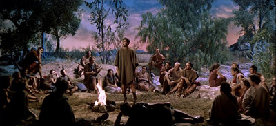
That kind of shot is what large-format film is designed for—you can see every dollar on-screen. And Spartacus lets you know with every frame that giant screens are the only way to see it; this was not shot with television in mind. Take the scene where Tony Curtis's Antoninus performs a magic trick for a group of rebel slaves. Kubrick opens with this shot:

A contemporary filmmaker shooting the same scene might use that framing as an establishing shot, but Kubrick stays on it for more than thirty seconds, following Curtis as he performs an entire magic trick. He only cuts closer when Curtis approaches Jean Simmons and Kirk Douglas, and even then the camera keeps its distance. It's true that long takes are still around, but look how little of the frame Curtis takes up, and keep in mind that the point of the shot is what Curtis is doing with his hands. There are ways to signify "epic" without using giant crowds.

I found it interesting to compare Kubrick's compositions with contemporary use of wide aspect ratios, more for what's missing than what's there. You won't find a shot in Spartacus that resembles this:
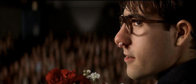
Or this, from a very different filmmaker the same year:
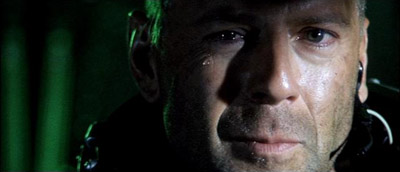
With a very few exceptions, Kubrick's close-ups show the actor's full head, as in this shot:

And, although there are plenty of wide-angle shots, you won't find anything like this:
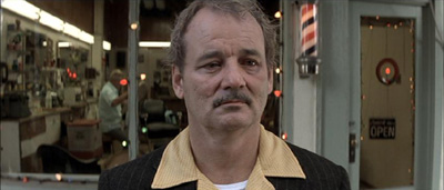
Or this:
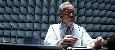
There are wide-angle medium shots, like this one:

But notice that John Dall is far enough back from the camera that his face isn't particularly distorted; compare that to Bill Murray's cartoonish face in the still from Rushmore (or pretty much any close-up in A Clockwork Orange). It's a different cinematic grammar, closer to classical Hollywood cinema than anything else of Kubrick's I've seen.

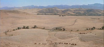
The camera movement is also atypical for Kubrick̬his previous film was Paths of Glory, in which the most striking visual images depend on tracking backward through the trenches—and of course, this is the man who would go on to photograph the corridors of the Overlook Hotel. But in Spartacus, the camera is pretty stationary throughout; most of the motion is panning, and limited examples of horizontal tracking. There most prominent exceptions bring us back to the "self-consciously epic" thing. There's a long shot of horsemen in a distant valley:

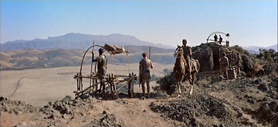
Which tracks back to reveal a watchman on the cliff above:

And then tracks further back to pick up Kirk Douglas on horseback:

From there the camera tracks horizontally as Spartacus rides through the camp. So Kubrick uses a track backwards to play with scale in a way that makes viewers painfully aware of what a gigantic production they're seeing. Then there's this sequence, after the climactic battle between the rebel slaves and the Romans:

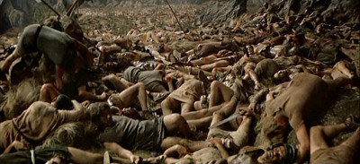
The camera tracks forward over the bodies of the defeated slaves, slowly panning up to reveal that the carnage goes as far as the eye can see. As with the other sequence, the tracking is used to for an effect of scale: you wouldn't believe how many corpses the Romans produced! And if this shot reminds audiences of another epic, then so much the better. So there are some examples of three-dimensional movement in the film, but I thought it was striking how stationary the camera remained, and how self-consciously horizontal many of the compositions are. It doesn't get any more wide-screen than this:

In short, it doesn't look anything like a Stanley Kubrick film. But this was an atypical production for Kubrick, the only one he didn't have near-complete control. He was brought in a week into shooting when Douglas fired Anthony Mann, handed a copy of the script and given a weekend to take over the production (his offer to rewrite the script was summarily rejected). Spartacus was a smart career move for him, since he hadn't made a film in two years and had never run a production of this size, but it's clear his heart wasn't really in it.2

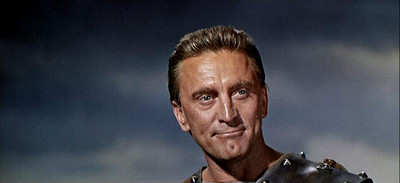
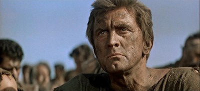
Which makes it sound like Spartacus was doomed to mediocrity by its troubled production history, but it does has its pleasures. Mostly, they come from the last ingredient for an epic: epic casting. There's no question that Douglas is the star (and plenty of shots of him looking noble):

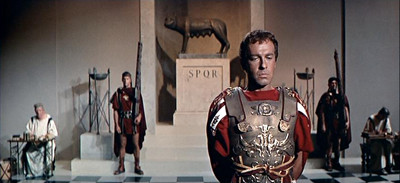
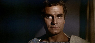
But you can't make a really big movie with only one star; convention demands that such a film be cast within an inch of its life. So for every scene where Kirk Douglas speechifies about freedom and slavery, there's a matching scene where Lawrence Olivier, as Crassus, is sinister and sly.

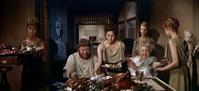
Better yet are Peter Ustinov and Charles Laughton, who often seem to be checking in from a different film, a light comedy about lust and gluttony.

As it happens, that isn't far from the truth: Ustinov apparently rewrote most of their scenes, much to Dalton Trumbo's dismay. So although it may not serve the rest of the film well, the scenes with Ustinov are better than the ones with Douglas. Ustinov won an Oscar for his performance; Douglas wasn't even nominated.

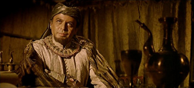
That isn't entirely fair to Douglas: it's always more interesting to watch vice than virtue. But the difference between the Roman scenes and the scenes with Spartacus is so great that I think it points to the film's biggest problem: Spartacus doesn't have any flaws. After the film's opening scenes, in which Spartacus is basically feral, he stops making mistakes. There aren't any arguments among the slaves about what to do, there aren't any power struggles between Spartacus and his lieutenants, there aren't any tactical errors. There are flickers of life when Herbert Lom appears as an untrustworthy pirate:

But for the most part the scenes with the slave army are a cinematic essay about how great freedom is in general, and how great Spartacus is in particular. Any actor would have a hard time making that kind of pablum interesting, but Kirk Douglas is particularly ill suited for it. I've always thought he was better cast as a villain than as a hero; he has a hail-fellow-well-met quality that only shines for me when it's backed by malice. But malice is beneath Spartacus, and that's the problem. In his effort to outdo Ben Hur, Douglas ended up playing a character who was too heroic to be interesting. Still, he's undeniably epic.

Randoms:

  • The commentary track on the DVD is fascinating, most of all for novelist Howard Fast's contributions, which run the gamut from passive-aggressive to positively venomous. Fast was originally hired to write the screenplay, then fired when it became apparent that his version of the film would contain more speeches than action. You can predict what he'll think of any given scene by checking how closely it follows his novel. Two examples:
    This, for example, is not in the book. I don't know that it adds very much. If I remember, the dialogue is rather silly.

    . . . .

    This is a brilliantly done scene; it is lifted out of the book almost in its entirety, and well directed, and well done.
    I highly recommend listening to the whole thing.

  • Spartacus gets a lot of credit for the political act of hiring Dalton Trumbo and crediting him under his real name, helping to break the blacklist. And it definitely deserves that praise. But it's also worth noting that the battle scenes were filmed in Franco's Spain, where the production paid the government directly for the uses of the Army. So Spartacus is one of those symbolically-upholding-freedom-while-paying-cash-money-to-dictators productions. Like U.S. foreign policy!

Update: Robert Taylor has thoughts in a similar vein about the film here.

1The difference between 65mm stock and 70mm prints is the 5mm section used for the film's soundtrack.

2As Kubrick put it years later, "I don't know what to say to people who tell me 'Boy, I really loved Spartacus.'"
Tuesday, February 01, 2011

#104: Double Suicide

Double Suicide, 1969, directed by Masahiro Shinoda, written by Masahiro Shinoda, Tôru Takemitsu, and Taeko Tomioka, from the play by Monzaemon Chikamatsu.

It's a truism that film has its roots in theater. Less remarked upon is how shallow those roots usually are: most movies owe more to melodrama and vaudeville than to Shakespeare. And they owe twentieth century drama almost nothing. Okay, there are a few exceptions: the highest of the highbrows might lift from Strindberg, Hollywood occasionally produces schlock Pirandello and very occasionally Pirandello. But tell me, which filmmakers take their cues from Beckett? Who are Ionesco's cinematic heirs? And when's the last time you heard a movie described as Brechtian? If you want to find a school of theater that's had less influence on film than the modernists, you'd have to go back to the truly obscure and neglected. Like, say, Japanese Bunraku puppet plays of the 18th century. But every rule has its exceptions, so allow me to introduce you to the film with the most statistically improbable dramatic heritage of all time: Double Suicide, the one and only Brechtian adaptation of an 18th century Bunraku puppet play.

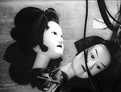
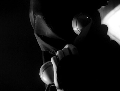
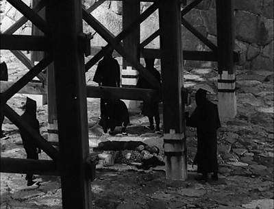
It's a bold move to try to create Brecht's verfremdungseffekt in film, the most seductive of all media. Shinoda manages it in several ways, starting with the title, which pretty much dissolves any doubt about the film's outcome. It's right up there with M. Night Shyamalan's Ghost of a Dead Psychologist. If that effekt isn't verfremdungs enough for you, Shinoda begins his film backstage at a Bunraku production of Double Suicide. Puppeteers gear up in black robes and hoods while a man who I assume to be Shinoda talks on the phone to "Miss Tomioka," presumably screenwriter Taeko Tomioka. "The lovers' suicide journey will be through a graveyard," he tells her. "I think it's stale," she replies.

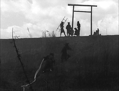
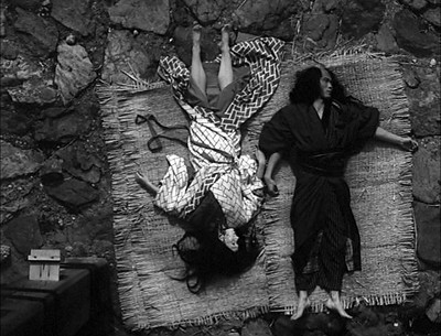
When the actual story begins, Shinoda constantly reminds the audience that they're watching a theatrical story with a predetermined outcome. The first time we see beleaguered merchant Jihei, he is crossing a bridge. We see four neat, geometrically composed shots of Jihei walking (none of which contain anything to puncture the illusion that we are observing a real person). Then in the fifth shot, the camera pans down from Jihei looking over the bridge to the rocks below. There, surrounded by puppeteers, the camera finds the bodies of Jihei and his lover.

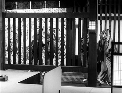
That bridge is one of the only realistic looking locations in the film. Shinoda's interiors are abstract and theatrical to the point of absurdity. Instead of walls or floors, he uses giant replications of period engravings, like some kind of pop art installation.

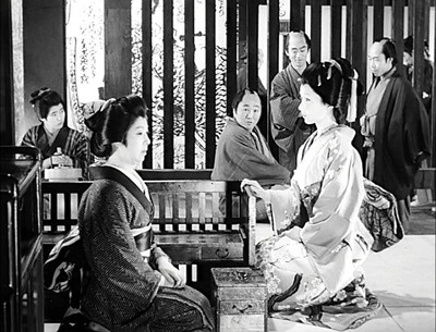
Again and again, the audience is forcibly discouraged from identifying with the action on screen, from forgetting they're watching a movie. This is Jihei's home:

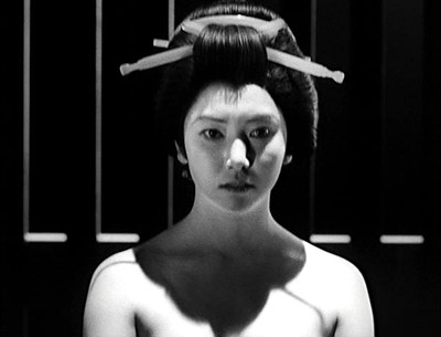
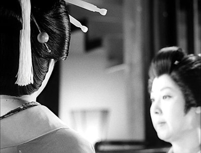
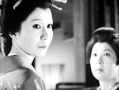
You can see in that shot that Shinoda is going to have a problem here: the composition and lighting are too good. It's just as easy to coast along on the images as it is to lose yourself in the onscreen narrative, and that doesn't serve the film's purpose. This is especially dangerous when someone as lovely as Shima Iwashita is in the cast, playing both Jihei's lover Koharu and his neglected wife Osan.

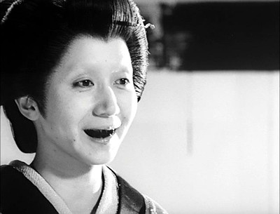
It would take a hell of a lot of obviously artificial sets to keep me from losing myself in images like that. Fortunately, Shinoda has a secret weapon: ohaguro!

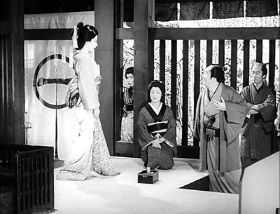
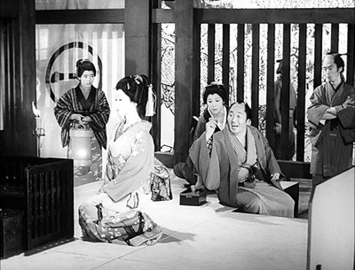
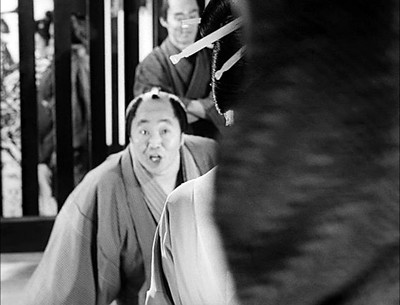
I wouldn't call that a Brechtian technique, exactly, but it certainly made me pull back from the screen. Joking aside, Shinoda pulls out all the stops to make Double Suicide as artificial and theatrical an experience as possible: odd compositions, 180-degree-rule breaking, bizarre sets, freeze-frames, and of course, puppeteers running from scene to scene in the background. Even his blocking is overdetermined to the point of distancing the audience. Here's how he handles a simple conversation between Koharu and Tahei, an obnoxious merchant played by Hôsei Komatsu. The camera picks up Tahei on the right side of a wide shot as he enters the brothel:

It pans left, following him across the floor, until he stops so that Tahei, Koharu, and the brothel's madam form three evenly-spaced vertical lines:

Koharu moves forward toward the camera before sitting; Tahei slouches where he is. The frame's symmetry is broken...

And then restored when Shinoda cuts to a different angle.

Note that Shinoda is close to violating the 180 degree rule here: the camera is now on Koharu's right. And the madam's position on the set has changed—although she moves forward at the end of the preceding shot, her left shoulder is still behind Tahei. In this shot, she's clearly in front of him. So the cut makes geometric sense, but it's just awry enough to feel a little off.

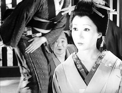
To hammer in the point that these are very carefully composed two-dimensional images, Shinoda does something I've never seen before. The madam stands up and walks off screen, crossing between Tahei and Koharu:

She then enters the frame again, from the right, crossing in front of Koharu:

Before sitting down again, in precisely the right spot so that her head takes up the same space in the frame that her body did before.

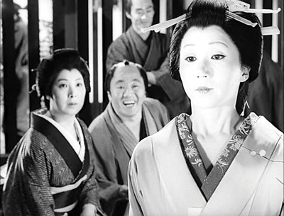
From here, we go to a shot that is ostensibly from Tahei's point of view; but the camera is closer than he is, giving us this striking framing of Koharu's head. Note the way the madam's head and the edge of the stairs balance the shot.

They turn towards the camera simultaneously, maintaining the frame's symmetry:

And then we get the one shot in this sequence that could belong to another film, a direct eyeline match between Koharu and Tahei:

Followed by another nicely composed deep shot: note that the madam and Koharu are much farther away from each other than they were before.

So what's so bizarre about this sequence that it warrants breaking it down shot by shot? For one thing, there's no master shot. The opening shot that pans left as Jihei enters the brothel is the closest thing to a master, and Shinoda never returns to it. When he does return to a wide shot, it's from a different position. I would be quite surprised if the actors ever ran through the entire scene in one take. Second, if you try to map out where everyone is in three-dimensional space, you quickly realize that people are moving between shots. On a first viewing, the overall effect of these changes between cuts is just a vague sense that something is off about the way the scene is shot—a more subtle version of Scorsese's water glass in Shutter Island. The point is that the blocking doesn't make a whole lot of sense in three-dimensions. In two dimensions, on the other hand, everything snaps into precise shape. Which can't help but remind you that you're watching two-dimensional projections of light, not prostitutes and their clients in a brothel.

So why do this? Why go to such great lengths to keep the audience from identifying with the characters, from losing themselves in the story? Well, if you don't identify with the characters and get lost in the narrative (and trust me, you will not be lost in Double Suicide's narrative), you are much more likely to think critically about how and why it is constructed the way it is. Brecht's goal was always to point out the underlying social and political structures, and most writing about the film (e.g., Aaron Cutler's notes on a Shinoda retrospective) ascribes similar motives to Shinoda. As Cutler puts it, the film "pushes its social injustice so forcefully that the only response is to want to push back." I think that might be true of The Love Suicides at Amijima, but I'm not convinced it applies to Double Suicide. Maybe the distancing effect worked a little too well on me, but the societal pressures bearing down on Koharu and Jihei seemed as artificial as the sets—and half as well constructed. Koharu and Jihei aren't doomed by their society. It's the puppeteers who build the gibbet.

The great innovation of modern tragedy is the illusion of choice. No matter what Oedipus does, he brings his fate inexorably closer, but, star-cross'd or not, Romeo and Juliet's deaths have considerably more to do with chance—if only that messenger had arrived in time! But surely we lose something important when we trade fate for happenstance. Maybe it could have all turned out differently for Romeo, Juliet, Koharu, Jihei. But that wouldn't make a very good story—something in us needs these things to go badly.

So how do you write a tragedy in an age where people believe "Invictus?" It's a little too late in the day to go back to theism or predestination. We're all genetically fated to grow old and die; that's a tragedy, but it's not a story. I am increasingly convinced that David Simon is correct: "the triumph of institutions over individuals" is the natural form for contemporary tragedy. Institutional inertia is as close as any of us will get to fate. The genius of Double Suicide is that it suggests that narrative itself is an institution. As the film moves towards its inevitable conclusion, Shinoda goes out of his way to suggest that the puppeteers are conflicted about what they're doing. There's no reason to show that conflict if you're interested in dramatizing a clash between personal desire and societal duty in 18th (or 20th) century Japan. There's every reason to show it if you want the audience to ask why we tell ourselves these kinds of stories; what we get out of watching Koharu and Jihei march off to die. As the double suicides promised in the title become more and more inevitable, there are increasingly frequent shots of one of the puppeteers (Shinoda himself?) looking on in anguish. But still he moves the sets and props around. These stories have rules.

Randoms:

  • There's a graduate thesis or two to be written about Shinoda's decision to cast his real-life wife Shima Iwashita as both the dutiful wife Osun and overtly sexual prostitute Koharu.

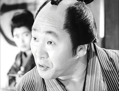
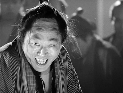
  • Hôsei Komatsu plays Tahei as kind of a jovial asshole, so it was a surprise to look over his IMDB résumé and see what appear to be mostly crime films (and the intriguingly named Female Convict Scorpion Jailhouse 41). But there's one scene where he unleashes the crazy and you can see why you'd cast him as the heavy.

  • There's a brief interview Shinoda and Shima Iwashita gave at UC Berkeley here. I was struck by this passage:
    There is a famous photograph of General MacArthur standing with the emperor and that made it absolutely clear that the emperor was no longer a god, and also it was obvious that that was conscious effort on the part of the Occupation to make that statement.
    He was a teenager when that photo was taken. You're never too young to ask yourself who's telling a story, and why.