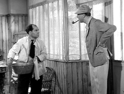
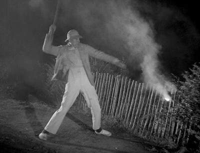
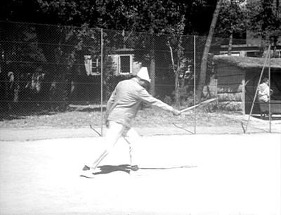
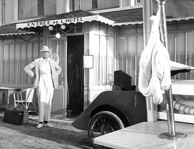
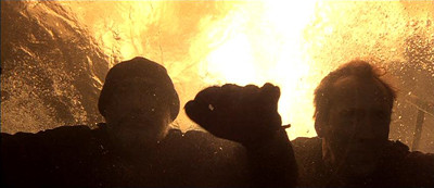
Mon Oncle, 1958, directed by Jacques Tati, written by Jacques Tati, with the artistic collaboration of Jacques Lagrange and Jean L'Hôte.
Not even Triumph of the Will announces its visual strategy as succinctly as Mon Oncle, which opens with the following credits:
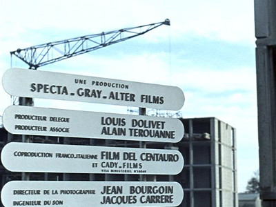
Followed immediately by the film's title:
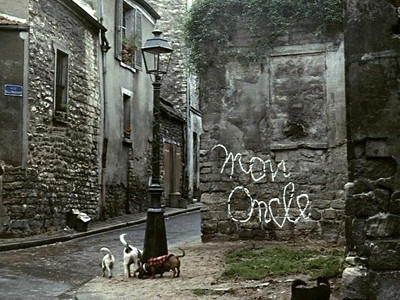
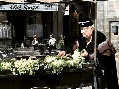
It's cold, sterile modernity versus warm, chaotic life, down to the adorable pack of wild dogs. Bet you can't guess which side Tati comes down on. It's a bit of a stacked deck: outside of Woody Allen movies, I'm guessing pre-Modern France wasn't always as charming as Tati makes it out to be.
Nor were the worst excesses of modern architecture as magnificently ugly as the film's central set, the Villa Arpel:
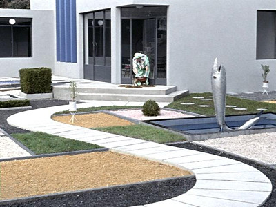
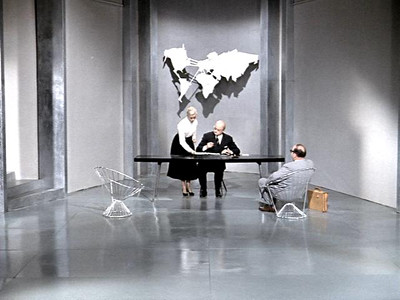
Too bad Mon Oncle was made before Brutalism really got rolling. It's the architectural equivalent of Ween spoofing Pink Floyd; designer Jacques Lagrange found a hidden dial in modern architecture and turned it to eleven. To say Mon Oncle was a step forward for Tati as a filmmaker is to understate the case considerably: Lagrange and production designer Henri Schmitt both worked on M. Hulot's Holiday, but nothing in the earlier film prefigures the kind of absolute mastery of the frame found in Mon Oncle. These would be the best designed sets in cinema—if Tati hadn't gone on to make Playtime. And Tati uses color precisely as Sirk: old France is all warm yellows and browns; modernity is, well, just look at it.
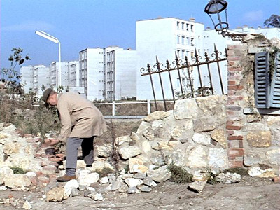
After establishing a hard-line distinction between the old world and the new, Tati throws Monsieur Hulot (dressed for the first time in a warmly-colored brown raincoat) into the gulf between them. There's a lovely shot of him carefully putting a stone back into place on the crumbling wall that divides the two worlds.
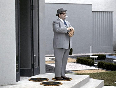
The Villa Arpel belongs to none other than M. Hulot's sister, her husband, and their nine-year-old son. The plot, such as it is, revolves around their efforts to figure out what to do with Hulot. In the character of M. Arpel, we find perhaps the closest thing to an antagonist in any of Tati's films. Jean-Pierre Zola plays him as the very embodiment of pig-eyed self-satisfaction.
It hardly seems like a fair fight. Of course, calling dirty pool misses the point: Mon Oncle makes no claims of realism. I wouldn't even call it a cinematic essay; it's more of a fantasia on The Theory of the Leisure Class, and there's nothing else quite like it. I'm not kidding about Veblen: his sidenote that the "canon of reputable futility" demands curved driveways (because they waste time and space, they proclaim that their owners have time and space to waste) comes to glorious life in a throwaway shot of Mme. Arpel and her neighbor animatedly greeting each other, staring off in opposite directions.

This is not to say that Mon Oncle is a critique of the ways in which modern design has failed to live up to the ideal of form following function, no matter how many times Tati returns to shots of characters pretending to enjoy sitting in painfully uncomfortable chairs.
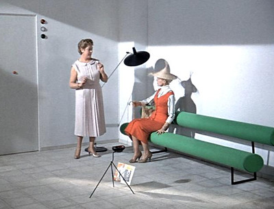
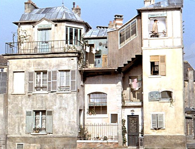
For one thing, M. Hulot's apartment is not exactly a triumph of functional design, no matter what color it is. In a long shot that I'm certain Wes Anderson has carefully studied, we see Hulot ramble his way through various windows and stairwells to the top left of frame. As Matt Zoller Seitz notes, it looks like a dollhouse.
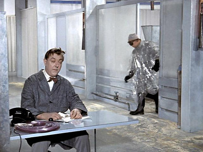
I love Seitz's observation that in the Arpels' hideous fountain, only turned on for guests, "you can see the gears of social need turning." I'm not so certain I'd go along with his assertion that Hulot is in any way part of the "mechanisms behind our modern world," however. You couldn't reverse engineer a smoothly oiled machine from his workplace performance, for instance.
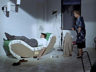
The only time we see Hulot fitting into the modern world like a cog in a gear, it's because he's gotten drunk, flipped a sofa on its side, and passed out.
Gears have been much on my mind recently; the best movie of the Christmas season is obsessed with them. It's worth noting here that for all its love of artifice and artificers, Hugo is built on the same premise that animates the Villa Arpel: people have a purpose; they can be repaired and fixed into place. Tati doesn't see it that way: there's no solution to the problem that is M. Hulot. And not just Hulot: one of the most delightful recurring gags in Mon Oncle has to do with a street sweeper who somehow never... quite... manages to swing his broom. There would be no place for him in Hugo's train station, where everyone has a job to do (even if that job is filming our dreams). Of course, there's an inherent tension in a meticulously crafted film that argues that meticulous craftsmanship is anti-humanist. But I think Mon Oncle manages to have it both ways—remember, the wall between Hulot's world and the Villa Arpel is crumbling. There's a wonderfully generous moment at the end of the film when M. Arpel, after banishing Hulot to the provinces, causes some Hulot-style chaos of his own. After inadvertently making a traveler walk into a pole, Arpel and his son hide behind their monstrous car, the son takes his father's hand, and for a moment, the two worlds are united.

So here's Tati throwing a brick into the clockwork that rules us, beatiful and intricate though it may be:
People think it is a message, but it isn't: one should be free to say to a man who is building a house, "Be careful. It might be too well-built."
Randoms:
- As with any well-crafted spoof, the architecture and design in Mon Oncle has attracted its share of people who can't quite believe it's their sacred calf that's being gored. There's a subgenre of writing about the film that I love for sheer wrong-headedness, nearly as much as lists of "conservative" movies: design aficionados defending the Villa Arpel. For the record, I don't think Mon Oncle is "a portrait of a dimwitted traditionalist’s impotent crusade against modern design." Nor do I think the Villa Arpel "documents the undeniable joy, delight, and creative exuberance unleashed by avant-garde modernism." If you disagree, you can vote with your wallet; Domeau & Pérès has some of it for sale. Sadly, as of this writing, no one is offering reproductions of the telephone from Brazil.
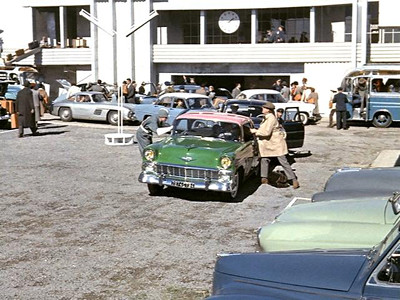
- At the risk of sounding like a wrongheaded design aficionado myself, the shots of rows of cars on their way to work have lost a bit of their power over the years, since every single car is better looking than anything currently on the market (though M. Arpel's Chevrolet loses points for its interesting paint job). There's even a Mercedes Benz 300SL in the background of one shot:
- It may be a soulless machine, but it makes me cry like Daisy Buchanan.
