Wednesday, October 26, 2005

#42: Fishing With John

Fishing With John, 1992, written and directed by John Lurie.

This is the first title in the collection that's not a feature. Instead, Fishing With John is a six-episode documentary fishing show in which actor/musician John Lurie goes fishing with celebrities. At first glance, Fishing With John has everything one would expect from a fishing show: bad video cinematography, dull conversation, and most importantly, a self-important narrator who solemnly explains what we're seeing. Here, for example, is part of the narration for the first episode, in which Lurie and Jim Jarmusch go shark fishing in Montauk:

Fascinating, our world today. With technology, man now knows more about his fellow man and the world he lives in than ever before. Yet we still know very little. We know very little, for example, about the topic of today's program: the shark. The shark has lived in the same form for millions of years. The word "Shark" came from the German word "shirke," which means "villain." How deep is the ocean? Nobody really knows for sure. Today's program and fishing adventure should prove to be fun. But it could also prove to be very, very dangerous. The shark has made fatal attacks on humans in every ocean in the world. There are 27 man-eating species of sharks. When it comes to the shark, man is on his menu.

You have to imagine that paragraph read by voiceover artist Robb Webb (who you've heard in a million trailers). It's the kind of blather that I usually just tune out, but here's the thing: none of it's true. Not even close. If the idea of a documentary voiceover that's filled with lies (and not jokes, really, just lies) strikes you as funny, you'll enjoy Fishing With John. It's a case study in really stretching the disconnect between visuals and voiceover. This is not for everyone: it requires an exceptionally dry sense of humor and a lot of patience, because the show is exceptionally silly. And I have my doubts whether it qualifies as great cinema, or great television, but it's certainly unique.

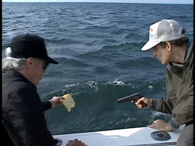
A fishing show is actually kind of a brilliant setting to use for this kind of experiment, because viewers are already trained to tune out while watching fishing, particularly to the narrators, who never say much of interest. Lurie does a good job of writing narration that seems plausible just long enough to make you start to tune out; then the narrator will say something like "Both fishermen are covered with sores and boners." Which doesn't make any kind of sense at all. This is not to say that all of the jokes and silliness is in the narration; far from it. Much of the rest of the fun comes from the fact that neither the guests nor the host know anything about fishing. Here, for example, is one of the shark fishing methods Jim Jarmusch and John Lurie try:
42-1
You can probably suss out how this is supposed to work. It doesn't.

Tom Waits, on the other hand, doesn't seem like a staggeringly incompetent fisherman, but when they finally catch a red snapper, he insists on putting the fish down his pants, because it helps with his depression:


This fish is going to have a confusing last few seconds on earth.

The show is at its best, however, when Lurie doesn't play around too much with what's actually on screen and instead lets the disconnect between what we're seeing and what the narrator is describing get wider and wider. He gets better at this as the show goes along. The fourth episode, in which Lurie and Willem Dafoe go ice fishing in Maine, is the first one where he really goes crazy with this; the episode opens with both men having a good time, but not catching any fish:
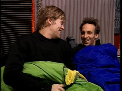
then shows them gradually getting colder and hungrier, until the last shot:
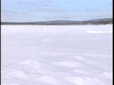
Over the shot above, Robb Webb intones, "On January 19th, John Lurie and Willem Dafoe died of starvation." And that's the end of the episode. As a footnote, when John appears in the next episode, the narrator says, "John's not dead after all. My mistake."

The disconnect between the narrator and what's on screen reaches its lunatic apotheosis during the last two episodes, a two-part story about fishing in Thailand with Dennis Hopper. As you can imagine, footage of Dennis Hopper fishing in Thailand is already pretty interesting, just because of how crazy and animated he is. Even in a silly hat, he looks like he could tear someone's throat out at any time:
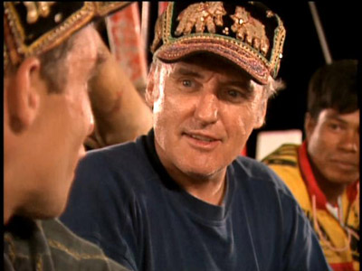
And there aren't that many people who can tell you stories about being thrown out of Cole Porter's house for drinking too much, or give their own ideas about a sequel to Easy Rider. So Lurie could have just let those episodes stand. But instead, he has the narrator superimpose his own version of what we're seeing: John and Dennis are going fishing for giant squid. It's apparent from the visuals (no one ever mentions squid at all) that this is the narrator's own idea. A few examples:

On screen: Footage of the captain of John and Dennis's boat ringing a bell.
Narration: "On the radio, the captain has heard a hysterical SOS from a nearby vessel. He believes this can only mean one thing: a giant squid!"

On screen: John and Dennis walking into an archway, or possibly a cave.
Narration: "In these caves, it is believed there are secrets as to the habits of the giant squid!"

On screen: John and Dennis visiting a Buddhist monastary.
Narration: "John and Dennis stumble onto the sanctuary of an order of squid monks. These monks live in seclusion and study the ways of the giant squid. John and Dennis try to coax them into divulging the secrets of the giant squid, but the squid monks only acquiese to show them photographs of their families."

On screen: John and Dennis asleep in their boat.
Narration: (having previously asserted that the giant squid can "hypnotize most mammals"): "John and Dennis... have been hypnotized!"

The calm, precise way in which the narrator keeps bending what's on screen to suit his own mad narrative is like a less tragic version of Pale Fire. Now I'm one of those people who thinks that a lie becomes funny if it's ridiculous enough and told with a straight enough face. So the show appealed to me, but it's definitely not for everyone. If the squid narration above didn't make you laugh, you should probably steer clear. There's not that much to learn about editing, cinematography, or structure from Fishing With John. And as I noted, it's not even a movie. So what's it doing in the Criterion Collection? My theory is this: If I'd seen this show on television, I would work my ass off to see that it was released on DVD, because no one I described it to would believe that it actually existed. So file this one under one of the less obvious goals of a DVD library: preserving the unbelievably odd.

Randoms:

  • The guests are willing to play along with John's craziness to varying degrees. Tom Waits came up with the idea of putting a fish down his pants, but over the course of the episode, seasickness and poor planning put him into a foul mood; after the episode, he and John didn't speak for several years. Matt Dillon, on the other hand, barely spoke while on the show. John hadn't wanted him as a guest, but the producers insisted. The episode revolves around John and Matt being taught a Costa Rican fisherman's dance to increase their luck. Matt, afraid of looking ridiculous, was only willing to dance around with John for a very short time, so this sequence rather obviously features the reuse of the same few seconds of footage again and again. Throughout the rest of the episode, Matt is extremely unwilling to talk, apparently for fear of being made to look foolish. Well, that won't do. So here, preserved for posterity, is Matt Dillon dancing around like a fool in Costa Rica:
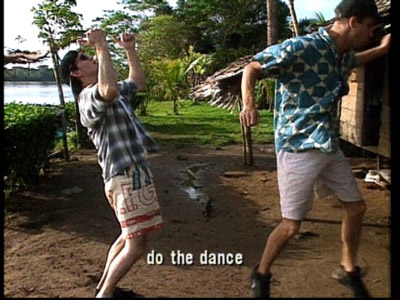
  • In the Tom Waits episode, Lurie had problems finding a boat large enough to film on (it has to be large enough to rock gently). There weren't any, so he bought an unseaworthy tugboat and had it fixed at great expense; its anchor, for example, was flown to Jamaica from Miami. I don't even want to think about the costs of shipping an anchor. Lurie describes this as his Werner Herzog moment. Here's the boat, looking spectacularly unseaworthy.
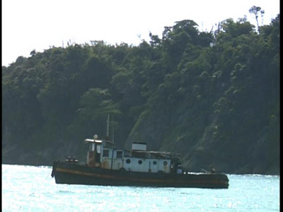
    The boat was unbelievably rusty and cut both John and Tom's shins to ribbons, which no doubt had something to do with Tom's terrible mood.

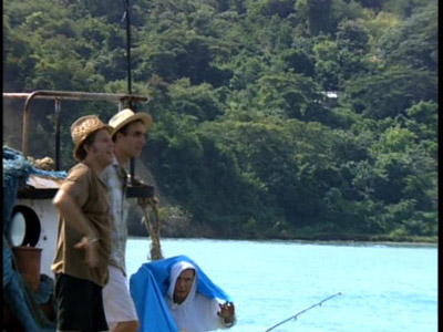
  • Although the show often gives the impression that John and his guest are fishing alone, the camera crew is always there, and sometimes very poorly concealed. For example, what's wrong with this still?
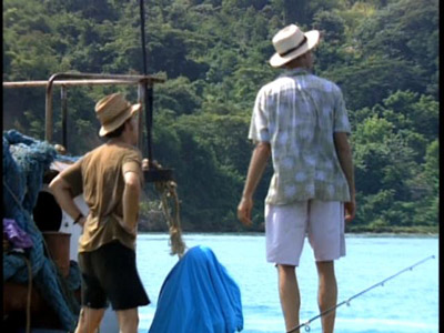
    If you answered "The camera guy hiding under a blue blanket," you're right. Here he is again:
  • If you do think straight-faced lies are funny, I highly recommend The Haggis-On-Whey World of Unbelievable Brilliance, a series of beautifully designed, lavishly illustrated children's books that contain not a single actual fact. Giraffes? Giraffes! is a personal favorite. Did you know that giraffes arrived on this planet on a conveyor belt from Neptune?

  • The cinematography isn't much when compared to film, and a lot of it is mediocre looking, but in a few places, it's beautiful. Here are two stills, both from the Thailand episodes:

    Looking at these locations, I can only conclude that I should start my own fishing show as soon as possible.
Sunday, October 02, 2005

#41: Henry V

Henry V, 1944, directed by Laurence Olivier, screenplay by Dallas Bower, Alan Dent, and Laurence Olivier, from the play by William Shakespeare.

It's not surprising that Great Britain produced a propaganda film during World War II in which an absolute ruler uses a flimsy historical pretext to justify an invasion of France. What's surprising that the ruler in question is the hero of the movie, rather than the Hitler surrogate his behavior would suggest. Although adapting Henry V seems to me like a perverse decision if your goal is to boost wartime spirits, Olivier's version of Henry V did this so successfully that it has become inextricably linked with the mythology of World War II. Band of Brothers wasn't about Agincourt.

In fact, adapting Henry V at all seems perverse to me; as Shakespeare goes, it's decidedly second-rate. In part this is because it followed Henry IV parts I and II, both of which feature an as-yet-uncrowned Henry V as a major character. By Henry V, Henry has already undergone all the character development he's going to, climaxing with Hal's rejection of Falstaff. In Henry V, he's nearly all brash self-confidence and action, which is less interesting than, say, Hamlet. The structure of the play is also weak; all the action is over by the end of the fourth act, and the fifth act, which shows Henry's courtship of Katherine, is both dull and unnecessary. The comedic sections of the play aren't very funny; Pistol, Bardolph, and Nym aren't appealing the way Falstaff is. And although Agincourt made Henry V a military hero (armed with longbows, his badly outnumbered men massacred 10,000 French while suffering fewer than 500 casualties), he was by most accounts a terrible ruler. In the play, he launches an unnecessary war, has one of his friends hung for petty theft, and orders the slaughter of unarmed prisoners of war. William Hazlitt quite correctly called him an "amiable monster." So how did Olivier make him a hero?

For one thing, he and Alan Dent purged the play of anything that complicates Henry's appeal. In the film version, Henry's domestic woes with the Scots are left out, as is the treachery of Cambridge, Scroop, and Grey. Olivier's Henry never slaughters his prisoners or hangs Bardolph. One gets the impression that if Henry's rejection of Falstaff weren't so central to the Henry IV plays, Olivier would have left it out as well. All this sounds like the movie isn't any good; it's one of Shakespeare's least interesting protagonists, minus what little complexity he has. (I'm referring here only to Henry V as he appears in Henry V—Hal in the Henry IV plays is a different matter). However, like many film adaptations of minor Shakespeare plays (see, for instance, Julie Taymor's Titus), Henry V has formal qualities that are interesting independently of the play on which it is based.

The big question with any Shakespeare film is how you're going to stage it. The tragedies seem to be most open to interpretation in this way (and, not coincidentally, they have the most archetypal characters). For an easy example, look at the three versions of Hamlet in the last fifteen years. Zeffirelli medieval staging, Branagh's 19th century version, and Almereyda's contemporary New York. With the history plays, I think most directors feel more bound by the fact that they're depicting actual figures from English history; Richard Loncraine's Richard III is the only dramatic restaging of one of the histories I can think of. Olivier doesn't abandon historical reality as dramatically as Loncraine does, but he does something I've never seen in a Shakespeare film before: rather than decide on one way of staging the film and sticking with it, he has three different settings and production designs, and moves from one to the other as the play progresses.

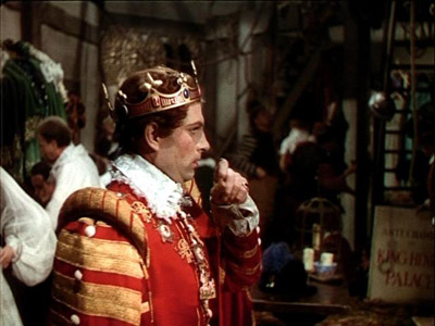
The movie opens by depicting a performance of Henry V at the Globe in 1600 (which was, at the time, the conventional date given for its first performances). Olivier chooses this setting advisedly; first, this staging immediately deflates some of the pomp and circumstance that audiences may be expecting with a Shakespeare play. Rather than seeing Henry for the first time as Shakespeare wrote him, entering surrounded by lords and attendants, Olivier shows us the actor who plays him clearing his throat as he prepares to go onstage.

Lawrence Olivier looks nothing like the Burger King here. You uncultured brute.

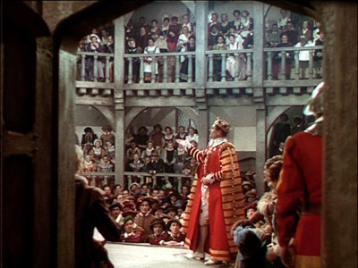
In fact, Henry's first speech is seen from the backstage area; note the audience in this shot. The shots of the audience provide the equivalent of a laugh track, coaching the audience on how to react through the first act of the play.

This audience reaction is actually critically important to Olivier, because the first act doesn't exactly make Henry out to be a hero. The Archbishop of Canterbury and the Bishop of Ely, worried that Henry will pass a bill that would impose great taxes on the church, convince him that he has a legal right to the crown of France, and send him on an elective war to claim it, thus distracting him from domestic issues. You don't get that impression from the movie, however, because Robert Helpmann's Bishop of Ely is a buffoon, and the entire discussion of succession is papered with physical comedy from Helpmann and laughter from the groundlings. I'm not really sure how one could successfully stage the Archbishop's speech in this section without it being deathly dull, but I do think that Olivier's solution has the added benefit of glossing over Henry's reasons for going to war. There are no distractions like Helpmann during the tennis ball scene, where Henry gives his first stirring martial speech. Unlike the church's machinations, of course, the tennis balls are Shakespeare's invention, and they make Henry seem more justified than he was. (If you haven't read the play recently, the French Dauphin sends a gift of tennis balls to Henry in lieu of the throne, suggesting that his time would be better spent at tennis than at statecraft).

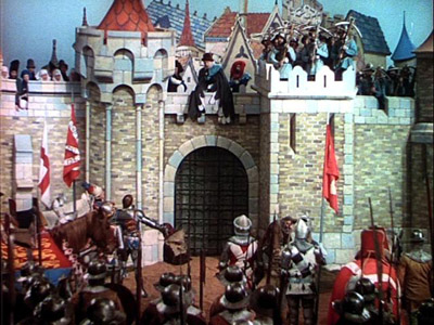
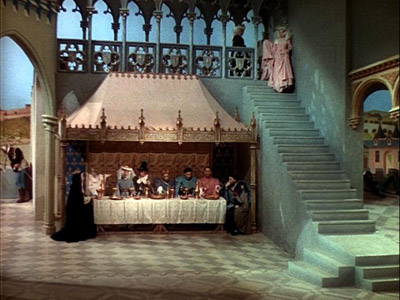
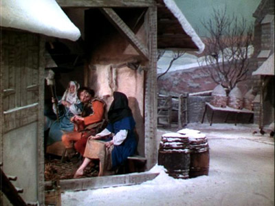
So far, so good; the movie settles into a nice flow between onstage and backstage action (though no dialogue is spoken backstage). Once Henry reaches Southhampton and prepares to set sail to France, however, Olivier enters a new section of the film. He imitates medieval illuminated manuscripts, with their flat staging, bright colors, and lack of perspective. It's really a bold move to make in a pre-CGI world, and I was impressed with how well he pulled it off. Because the staging in the early sections of the film is deliberately cheesy (as one might expect in a theatrical production circa 1600), and because the sets in this section are incredibly artificial-looking, it's easy to miss how carefully and deliberately they have been designed. Here are three examples:

Compare this to any medieval depiction of an army you choose. Notice how the slight downward angle of the camera simulates the pre-perspective medieval convention of using height to indicate depth.

Again, height equals depth—and notice the archers in the right-hand tower, artificially posed as they might be in art of the time.

This is part of the French court; no one in their right minds would lay out a room this way.

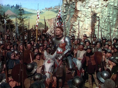
The third section of the film begins at Agincourt and is staged realistically. Here's the first shot:

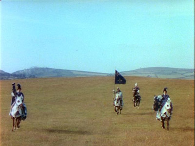
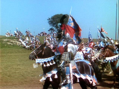
Mountjoy and his attendants ride their horses right at the camera, hitting viewers over the head with the fact that the third dimension has now returned. This act was my favorite; Olivier's Eisenstein-inspired depiction of Agincourt is the most exciting and accessible portion of the film by a lot. The French Cavalry's charge is really excellent filmmaking, including a showstopping 1/2 mile long tracking shot. Here's the beginning of it:

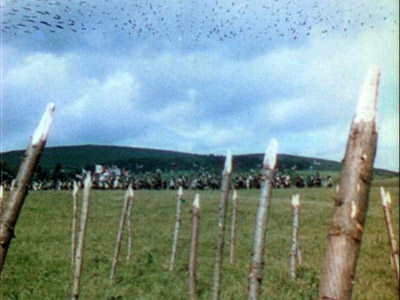
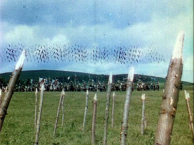
The camera stays on the knight in the center of the frame as the entire line of horses slowly accelerate from a walk to a full-on gallop. The shot lasts just under a minute, and the sense of tension and speed it gives you is incredible. It's followed by Henry's archers letting their first volley fly. Apparently this shot is lifted from Alexander Nevsky, but it's been in hundreds of movies since then, from Gladiator to Lord of the Rings:

Arrows go up...

Arrows go down. You'll have to imagine the sound effect of hundreds of arrows whistling through the air, but it's there.

This section is pure bravura filmmaking, and it has aged much better than the rest of the movie. Following the open fields at Agincourt, Olivier brings the film back to the illuminated manuscript sections, and finishes the movie as it began, at the Globe theater. The symmetrical layering of production design feels a little like an undergraduate computer science lecture on recursion; I can't think of another film with this kind of structure, much less a Shakespeare adaptation.

Interesting structure can make a film a curiosity, but it's not enough to make it worth seeing. To me, except for the Agincourt section, the movie simply wasn't very compelling. In part, my feelings here are predictable; as you've probably noticed, Henry V isn't my favorite Shakespeare play. And my experience watching Olivier deliver the St. Crispin's Day speech (which he knocks out of the park) is obviously different than it would have been for a Brit in 1944. But the vast majority of the movie is very theatrical, and I found it hard to get past the stylized production design and into a point where I cared about any of the characters. That sounds like the whine of a bad filmgoer or studio executive ("the characters aren't relatable!") but I think it's a fair criticism. Shakespeare more than any other writer is renowned because his characters have resonated with viewers for hundreds of years. Henry V doesn't really accomplish that.

Randoms:

  • Henry V was probably the first movie to be developed from a television project. Dallas Bower, one of the producers, had worked with Olivier on a BBC program called "Scenes from Shakespeare," which was broadcast in the late thirties, at a time when there were perhaps 500 television sets in England. So the next time you're sitting down to rewatch Starsky and Hutch or The Dukes of Hazzard, give a little tip of the hat to the filmmakers who made it all possible.

  • The production design during the medieval painting sections of the film was inspired by Les Très Riches Heurs du Duc de Berry, a book of hours that was unfortunately in occupied France when the film was made. So the art department was working from magazine reproductions of the calendar section of the book. The costumes draw from the book throughout, but the most blatant quotation is the shot that opens Act V. Here's the illustration for February from the book:

    and here's the opening shot from Act V.

    That's Robert Newton in red, looking considerably less menacing as Pistol than he did as Bill Sykes in from David Lean's Oliver Twist.

  • You might be wondering how Olivier pulled off battle scenes with hundreds of able-bodied men running around on camera in the middle of World War II. He did it by shooting in Ireland, which was neutral during the war, using Irish soldiers as his extras. This had the added advantage of making it less likely he'd have to stop a shot because a German bomber flew in-frame.

  • You've probably noticed from the stills the oversaturated Technicolor look the film has. Although most of the movie uses the kind of brightly lit sets that Technicolor representatives recommended, the scenes in 4.1 are quite dramatically underlit. Here's an example:

    Gordon Willis was presumably taking notes. Incidentally, the Criterion edition was transferred to DVD using the YCM protection masters. This is an archival format related to the three strips of Technicolor Process 4. If you don't know how Technicolor worked, check this article out. Anyway, in Technicolor Process 4, your end product is three exposed black-and-white negatives, one for Yellow, one for Cyan, and one for Magenta. These are better for archival purposes than a color print (or an Eastman one-strip color negative) because black and white film ages better. In a YCM master, the three strips are combined into one black and white print with consecutive frames from each print; you get a frame from the yellow print, then the cyan, then magenta. Why combine the strips into one master instead of storing them separately? If anything causes the film to shrink, warp, or fade, this will affect all colors equally.

  • Filippo Del Giudice, another of the film's producers, spent the last five years of his life in a monastery. If only this option had been available to Don Simpson!