Wednesday, September 14, 2005

#40: Armageddon

Armageddon, 1998, directed by Michael Bay, screenplay by Jonathan Hensleigh and J. J. Abrams, adaptation by Tony Gilroy and Shane Salerno, story by Robert Roy Pool and Jonathan Hensleigh (I have no idea what work those writing credits actually correspond to).

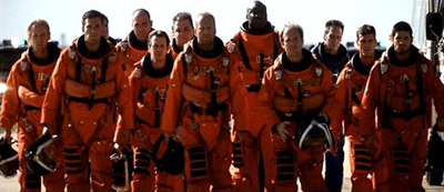
Armageddon seems like an odd choice for a Criterion edition, but if the collection is intended to provide a representative sample of film throughout history, neglecting the late-90's studio system would be silly. If you're one of the three people who didn't see it, it was pitched as "Red Adair in space," and later as "The Dirty Dozen in space." The basic story (and it is the most basic of stories) is that a gigantic asteroid is on a collision course with earth, and NASA sends a group of twelve oil-drillers into space to plant a nuclear bomb that will destroy the asteroid and save the planet. Here they are in full The Right Stuff-hero-mode (which is the only mode they've got):
Armageddon exemplifies a certain type of movie; the big, dumb, loud, critic-proof summer blockbuster. This sort of disaster movie is still around, but it's evolved a lot in the last seven years. The closest thing to Armageddon this summer was War of the Worlds, which is a much more thoughtful movie. Here's why:
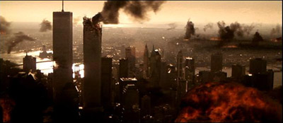
New York, post meteor shower.

The destruction of American cities is no longer a guilt-free pleasure. There's a reason that The Onion namechecked producer Jerry Bruckheimer when they wrote this, and Armageddon is his masterpiece. Watching it now, you see so many scenes that simply could not be made today, or even conceived of, and for me that made rewatching it oddly poignant. The men and women who worked on the film were certain that they were living at the end of history. Too bad it didn't work out that way.

Critics who thought Armageddon was a sort of terminal end point for filmmaking (which is to say, all of them except David Edelstein, as far as I can tell) missed the point. Janet Maslin, for example, wrote, "Armageddon tries to tell a coherent story of guts, young love and space travel." But I don't think it does try; it's not really interested. You wouldn't criticize Star Tours or Batman: The Ride for shoddy characterization or wooden acting, and it doesn't seem fair to me to treat movies like Armageddon as though their writers and directors had the same goals as, say, Tarkovsky. David Foster Wallace put it best (in "David Lynch Keeps His Head"):

Art film is essentially teleological; it tries in various ways to "wake the audience up" or render us more "conscious." (This kind of agenda can easily degenerate into pretentiousness and self-righteousness and condescending horsetwaddle, but the agenda itself is large-hearted and fine.) Commercial film doesn't seem like it cares much about the audience's instruction or enlightenment. Commercial film's goal is to "entertain," which usually means enabling various fantasies that allow the moviegoer to pretend he's somebody else and that life is somehow bigger and more coherent and more compelling and attractive and in general just way more entertaining than a moviegoer's life really is. You could say that a commercial movie doesn't try to wake people up but rather to make their sleep so comfortable and their dreams so pleasant that they will fork over money to experience it – the fantasy-for-money transaction is a commercial movie's basic point. An art film's point is usually more intellectual or aesthetic, and you usually have to do some interpretative work to get it, so that when you pay to see an art film you're actually paying to work (whereas the only work you have to do w/r/t most commercial film is whatever work you did to afford the price of the ticket).

Some movies blur those distinctions (all of the studio products so far in the Criterion Collection, for example), but Armageddon may be the most commercial film ever made. And I mean that in every sense of the word commercial; Roger Ebert called it "the first 150-minute trailer." Michael Bay and his cinematographer John Schwartzman made the jump from advertising to features, and they brought that sensibility with them. What you get is perfect framing, beautiful photography, but what's actually on-screen is pure wish-fulfillment in a way that's completely divorced from narrative. Like this:

That's the end shot of a love scene between Ben Affleck and Liv Tyler. It's lovely, but it doesn't have any basis whatsoever in reality. Where is the house they've driven to? Does it belong to either character? Why have they strung Christmas lights in the tree? When did they do this? Are we really meant to believe that A.J., a roughneck who works on oil rigs, drives a cute little BMW Z3 when he's on dry land? You can take nearly any frame in this movie and pick it apart in this way, but that presupposes that the goal of this film is to tell a story, and I don't think that's true. The story is a vehicle for the wish-fulfilment you're paying for; when it's in the way, it's jettisoned. This shot does exactly what it sets out to in terms of the mood it evokes in the viewer. It's not a subtle emotion, it's not a subtle shot, and it's not a "justified" shot in any way, shape, or form. But as fantasy, it's great; it's the world advertising has always promised us. (And, of course, it is advertising: BMW paid a good deal of money to have A.J. drive such an unlikely car).

The point is, that shot succeeds brilliantly at "enabling various fantasies that allow the moviegoer to pretend he's somebody else and that life is somehow bigger and more coherent and more compelling and attractive and in general just way more entertaining." So does the rest of the movie. Seen from those terms, all the laughably absurd plot points and continuity errors in the world don't really matter. So the movie takes place in a world without time zones, in which it's simultaneously daylight in India, New York, and Paris; so what? You think Bruce Willis has time to keep track of time zones when humanity's future is at stake? Here's a single tear for narrative coherence:
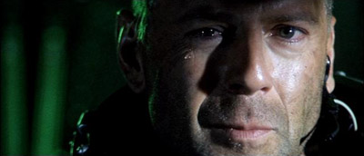
Now if you'll excuse me, I've got a planet to save.

There's another reason Armageddon specifically belongs in a collection like this one: thanks to Top Gun, Jerry Bruckheimer was able to get the crew unbelievable access to NASA facilities during the filming of this movie. So there are shots and sequences that are completely unprecedented, and sheer techno-pornography for someone who, like me, grew up in love with the space program. (Let me put it this way: at age 6, I had a record of radio highlights from the first Columbia launch). Except for mission control, most of the NASA facilities you see in the movie are the real thing, from the vacuum chambers to the shuttle assembly building to the neutral buoyancy pool. Ben Affleck and Bruce Willis became (and remain) the only two civillians to ever wear real space suits for the underwater sequences. This shot isn't faked or altered in any way; that's the cast of the movie on the real gantries with the real shuttle, a few days before a real launch:
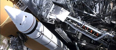
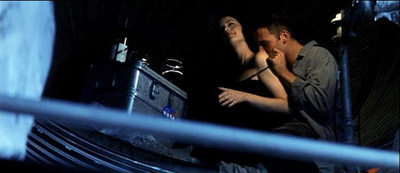
And could there be anything hotter than making out in one of the rocket exhaust cones of the Saturn V booster?
Of course, my own weird space-nerd childhood doesn't really have a bearing on the movie for most people. But it is valuable to see an example of the sort of filmmaking excesses that can result when a filmmaker is allowed to have anything he wants. For example, there's a scene where William Fichtner briefs the crew. In the real world, this would probably happen in a briefing room. Michael Bay decided he wanted it to happen in the shuttle assembly building with a B-2 and 2 SR-71 Blackbirds. So the Air Force flew in the planes, asked him where to park them, and this is the result:
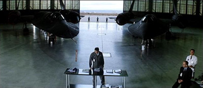
You can't see the B-2 in this shot because it's parked over to the left. It had to be there, because both the engine exhaust and the trailing edge of the wing were classified at the time and could not be photographed. When you see the movie notice that the tail end of the plane is always out of frame. In fact, the crew wasn't allowed to see the back end of the plane at all. Which is to say that Jerry Bruckheimer is able to get the Air Force to risk national security to indulge his director's whims. That sort of excess is unparalleled in film history. And it actually doesn't make me too happy with the Air Force, because, after all, I paid for part of the production of Armageddon, as did most of you. Without any back-end participation at all.

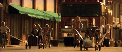
The level of personal wish fulfilment in Armageddon is pretty easy to pick out; it's worth noting that Michael Bay also sells a kind of national wish fulfilment. Armageddon has a serious hard-on for the early days of the space program, specifically for the sense of national purpose it gave the country. In fact, the movie suggests that that America, that national conception of ourselves, is still pretty much what we are, as you can see below. Show these four frames to someone who doesn't know what they're from and ask them what year each one depicts:
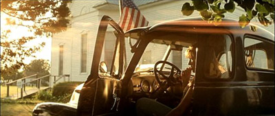
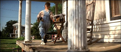
My guess is nobody says 1998 for any of them. Note the NASA hero-worship in the third frame; here's a close-up of one of the soapbox derby cars:
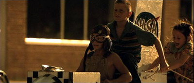
When's the last time you saw a kid with a helmet like that, much less a soapbox derby car? The more observant among you will have also noticed that the last still quotes this photograph from Robert Frank's The Americans:
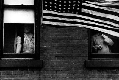
That photo was taken in the early fifties, before Sputnik, and definitely falls under "American mythmaking" (put it this way, Jack Kerouac wrote the introduction to the collection). None of the above is subtle, but here's maybe the most blantantly manipulative shot in the film:

In case you miss it, this shot is immediately followed by one of the astronauts saying "Kennedy, we see you. And you never looked so good!" Of course, he's talking about the Kennedy Space Center...or is he? The point is, these sections are shamelessly manipulative and there's nothing delicate about them. Nevertheless, they have an elegiac tone that's more moving than anything else in the movie. And they seem motivated by a genuine longing for a national purpose, and national heroes, for a more innocent version of America. Of course, that America never really existed, and Armageddon offers Bruce Willis as just the sort of national hero we're looking for, but hey, you take your pleasures where you find them. If you're willing to let go of outdated values like "coherence" and "narrative," you'll find plenty to love in Armageddon.

Randoms:

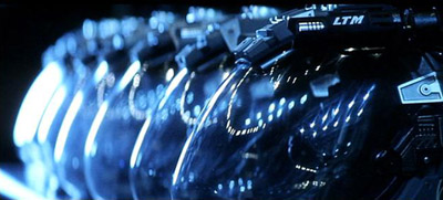
  • If you want to piss off a DP, make him shoot space helmets that expose the whole face. There's nowhere to hide a light (notice how much of the face is covered in the helmets in movies like Alien), which means you have to light them from outside the helmet, which means reflections. John Schwartzman eventually came up with the solution of sticking a light on top of every helmet, so that when you saw reflections of lights in every shot, you would at least think they were coming from another astronaut's headlight and not from a film crew. Here are the helmets:
  • Disney's marketing campaign for Armageddon is a story in and of itself. A few highlights:

    • 50 minutes of the film was shown at Cannes to laughs and catcalls. After the screening, Bruce Willis gave the most hostile press conference of his career, berating the assembled foreign journalists for their reaction to the movie.

    • This was the second asteroid movie that summer; the first was Deep Impact. Disney thought its only real competition was Godzilla, however, and that's why there's an early scene of a toy dog mauling a Godzilla doll (N.B.: those scenes feature a dog that had been specifically trained to attack Godzilla dolls!).

    • Commercials for the movie, including the Superbowl spot, are included on the disc. I thought it was incredible how primitive they seemed compared to ads for movies right now. But I suppose they seemed primitive at the time, too.

    Anyway, with a movie like Armageddon, the marketing is half the story; it's exhaustively documented in Peter Bart's The Gross.

  • This is a more religious movie than any other action film I can think of. Characters are continually invoking God and praying. Like the shots of a non-existant small-town America, this is described on the commentary track as an entirely cynical ploy to attract people from flyover country. Given the amount of contempt most studios have for the intelligence of moviegoers in red states, it's strange to me that this particular cynical ploy isn't used more often. If you have any doubt about Hollywood studio executives' feelings about the middle of the country, let me put it this way: a few months ago I saw a memo from a well-respected producer to a well-respected studio executive in which he argued that a director who both men thought was out-of-touch and past his prime would be perfect for a particular project, because only someone out-of-touch could make a movie simple enough for moviegoers in the middle of the country to relate to. This is not, by a long shot, the worst example of this sort of thing, and if I ran a studio it'd be the first thing I'd ban; if executives made movies they actually wanted to see, I think the world would be a better place. Note also that when I say "studio executives," that's who I mean, not filmmakers and not some nebulous idea of "liberal Hollywood."

  • Watch for a nice cameo by Udo Kier, star of Blood for Dracula and Flesh for Frankenstein. He plays the psychologist who has to analyze the astronauts to be. For reasons only he can explain, Michael Bay chose to set these scenes in a parody of a soundproof room with spiked walls:
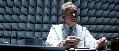
    It's-a me! Dracula!

  • Armageddon does cheat on at least one NASA location; Mission Control. Here's the film's version:
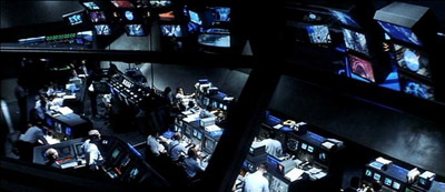
    And here's the real thing, also in the film:
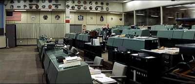
    You can't make him out, but that's Owen "Butterscotch Stallion" Wilson goofing around in the old mission control. Despite looking like a community college classroom, that's where they ran the moon landings.

  • There are some excellent features about the special effects. The most surprising is this shot of the destruction of Paris:
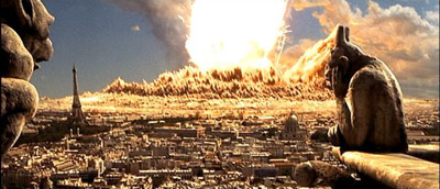
    I always assume shots like this are completely CGI (and today they probably would be), but in fact only the overlay of the Paris streets below is CGI. The gargoyles are a real shot, and the blast circle approaching camera was made by photographing a real explosion of nearly 50 concentric circles of explosive buried several feet under dirt.

  • Although Robert Towne supposedly did some polish work on this script, Steve Buscemi contracts "space dementia" at a certain point in this movie, for no apparent reason, and with no real consequences. I just thought that should be clear at the outset if you're planning on watching it for the quality of the writing.

  • There's an entire commentary track with the "science advisors," a NASA employee and a former astronaut, who tried to make the movie as scientifically accurate as possible. Listening to these guys talk about their constant battles to get Michael Bay and company to make the film at all relate to the world of science (for example, when Mir explodes, it explodes, like it's in an atmosphere) is a case study in cognitive dissonance.

  • The Armadillo, the drill car they drive around on the asteroid, has a chin mounted chain gun. You might wonder when NASA started putting weapons on their vehicles, or what they were expecting to shoot at on an asteroid, or even how they expected bullets to fire in a vacuum. But in fact, this wasn't NASA's decision so much as Mattel's; there was a toy version of this car, and toys with guns sell better. I'm not kidding; plot points were decided on by the toy company.

  • Manny Perry, the guy who was the MPAA's copyright spokesman for a few glorious months, did some of the stunts in this. I can't begin to tell you how delighted I was to see his name in the credits.

  • Like I said, the NASA sets were mostly real. Ben Affleck's teeth? Not so much. And I wouldn't put money on Tom Cruise's. Here's Michael Bay talking about working with Affleck on the commentary track:
    I had him work out. We paid for a set of twenty thousand dollars of pearly white teeth—Ben's gonna hate that story—uh, I always like low shots that kinda come right under your chin, just make you a little bit heroic, and he kinda had these baby teeth. So, uh, I told Jerry Bruckheimer, I said, "God, he's got these baby teeth, Jerry, I don't know what to do." Jerry used a very famous star in a... plane movie that he replaced teeth with so, uh, he says, "We did it to him, why not do it to Ben?" So my dentist had Ben sitting in a dentist's chair for a week, eight hours a day.
  • If you develop over 1,000,000 feet of Kodak film on a single production, Kodak sends you a gift basket with six bottles of Korbel. Michael Bay complains on the commentary that they could have sent two bottles of Dom Perignon for the same money. So, Kodak, if you haven't sent out those gift baskets for The Island yet, take note.

Armageddon was a nice break from my self-planned crash course in foreign and art house film. Now it's back to movies with a little more on their mind. At least until I get to The Rock.
Sunday, September 04, 2005

#39: Tokyo Drifter

Tokyo Drifter, 1966, directed by Seijun Suzuki, written by Yasunori Kawauchi.

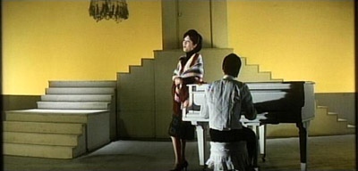
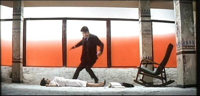
This is another one of Seijun Suzuki's movies for Nikkatsu, and, like Branded To Kill, it has a pretty banal script but is worth seeing for its lurid style. Suzuki got to shoot this one in color (he never made this decision himself, as he explains in an interview on the disc) and, well, never let it be said that he didn't use enough color. The exterior shots in this movie feature realistic looking streets, but the interiors are abstracted to the point of absurdity and feature eye-popping colors. This is easier to see than to describe:

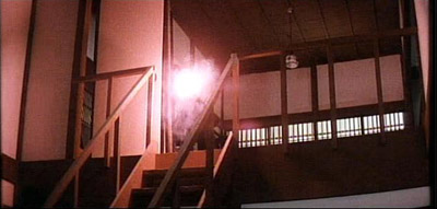
So, yeah, give Suzuki a color palette and he's going to make full use of it. Stranger still, the colors have thematic significance, which I'd seen in the theater but never on film (at least not so blatantly). Take the bottom still: the man in the red coat is Otsuka, the villain of the film. Pretty much any shot he's in, they'll be some other object arbitrarily colored red, which in this movie is also the color of violence. When the woman in the middle still is shot, the windows behind her are halfway colored red; later, Suzuki cuts back to that shot but the windows are now fully red, as though they've filled up with blood. His fidelity to this color scheme extends to the special effects: at a crucial moment, the hero's gun has a red muzzle flash, as below:

Thematic use of color isn't some great, startling invention, but I have never seen a movie that stayed so faithful to its initial rules. As with Branded To Kill, however, the question to ask is not whether Suzuki is stylistically inventive (he is), but what his style is in service of. And although Tokyo Drifter is a much more accessible movie than Branded To Kill and has a much more traditional style, it seems to me to have more going on beneath its surface than Branded To Kill did. It has a standard Yakuza plot, but scratch it and you'll find a critique of Japanese adoption of Western culture, customs, and economics after World War II. I don't mean to suggest that this movie is the work of a genius; in a lot of ways (the acting, for instance) it struck me as mediocre. But it's more interesting than it looks at first glance.

I'm not sure how much of the subtext of Tokyo Drifter is Suzuki's and how much was in Kawauchi's screenplay. I do know that Suzuki routinely made dramatic changes to the scripts he was assigned; in the interview on the disc, he says, "I believe if the script is perfect, there's no reason to make a movie of it." But some of the things in the dialogue are also played out in the set design, so Suzuki clearly had something to do with it. Here's the basic setup. Tetsuya Watari plays Tetsu, the right-hand man of a criminal boss named Kurata. Kurata is trying to go straight, and Tetsu is commited to helping him do it (the movie opens with Tetsu allowing a rival gang to beat him up rather than fight back and provoke them). Kurata is in the process of buying an office building from a man named Yoshii, and another criminal boss, Otsuka (the man in the red jacket above), wants to buy it from under him. The movie chronicles Tetsu's betrayal by his boss; he begins the movie fiercely loyal, and ends completely adrift.

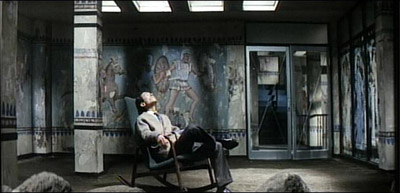
Throughout Tokyo Drifter, Suzuki contrasts Tetsu's value system, based on loyalty, with Otsuka's, based on profit. This is the same thing you see in The Godfather, with the exception that Suzuki explicitly links Otsuka's values to western culture. You can pretty much tell how evil a particular character in this will be from how western they are. Yoshii, for example, is a capitalist; he owns the building that Kurata wants to buy, and he's making his living from interest. However, he's still basically a nice guy; he cuts Kurata a break early on, and he seems to represent the best that western civilization has to offer: an ethical business man. So you would expect that his surroundings would reflect that. And here's his office:

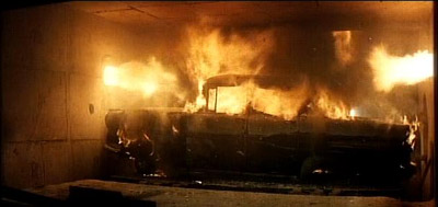
Yes, those are Greek frescoes on his walls: western, but not modern. Yoshii, by the way, gets killed about twenty minutes into the movie by Otsuka, who is more of a modern westerner. Otsuka's office is in the upstairs lounge of a club that's filled with teenage Japanese kids dancing to rock and roll, and one of his trusted hitmen drives what appears to be a 1957 Chevy. Tetsu's attitude towards this aesthetic, at least at the beginning, is exemplified by what he does to the Chevy: he steals it, drives it to a junkyard, and parks it here:

So that's a pretty simple dichotomy. What complicates it is that over the course of the movie, Tetsu changes from someone with a classic Japanese concept of loyalty into someone closer to the hero of an American Western. The movie ends, in fact, with an archetypical American Western scene: Tetsu rejects the love of a woman he used to pursue, and walks off into the night alone. If you have any doubt that Suzuki has American Westerns on the brain, halfway through the movie is a gigantic brawl at a "Saloon Western," complete with swinging doors, people getting hit over the head with chairs, and people being thrown out through a glass window right next to the bar. Western heroes don't form attachments to women; they act for themselves until they are forced to act. When the time comes, however, they use violence with great precision as a tool to defend the powerless. That's more or less where Tetsu is at the end of the movie, but he's definitely a Japanese version of this character; rather than killing his former boss, he gives him a broken glass and lets him commit suicide. I think the idea of honor is what replaces the idea of loyalty in a Western hero, and Tetsu's conception of this is a Japanese one. How long will that ideal stand against the western morality of money and power? Well, Tetsu does kill the bad guys and escape. But right before the last shot of him walking away, Suzuki sneaks in a montage of some neon signs around Tokyo that suggest that he's a bit more pessimistic than his script would suggest. The signs read, in English:

Copacabana.

NEW Latin Quarter!

SHOPPING ARCADE.

Randoms:

  • I didn't have any random thoughts or facts about Branded To Kill, mostly because I had to work pretty hard just to make sense of it. Sorry.

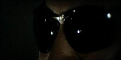
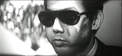
  • Tokyo Drifter marks the third Criterion Collection movie set in modern Japan, and the third Criterion Collection movie set in modern Japan that has a villiain wearing sunglasses. Do the Japanese hate sunglasses? Tokyo Drifter's version of this is especially jarring, as it features lots of closeups of Otsuka's glasses, like this one:

  • In 1985, Seijun Suzuki was named the Best Dressed Man in Japan by the Japanese Fashion Society.

  • The interview on the disc with Suzuki has what might be the secret to why the acting in this movie isn't so spectacular. Here's what he says:
    Tetsuya Watari, who is the main character in Tokyo Drifter, is now one of the biggest stars in Japan. So, now I wouldn't want to say anything that would hurt his reputation, but I think... Tokyo Drifter was his first feature film, I am pretty sure of that. And I had orders from the company to make Watari a star. But, on the set, he couldn't say the lines when we called action. He froze and was speechless. In order to make him say the line, let's say he was sitting somewhere in the scene, the AD would hide behind the chair and hit him with a broom or something, then, I don't know why Watari could say his lines, but he did. That's the most memorable thing about Watari.
    Not a big vote of confidence from your director, Watari.

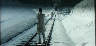
  • After the great action sequences in Branded To Kill, I was expecting some excellent fight scenes. But the fights in this movie seemed too abstract to be much fun. The final gun battle takes place in a nearly empty room, bathed in light; it has nothing of the messiness that makes the action in Branded To Kill exciting. There is one very tense showdown in Tokyo Drifter, however (and, not surprisingly, it's set outside, where the surroundings are more realistic). I'll just put up a still and you can sort out what makes it tense for yourselves.

  • In an interview I read about Kill Bill, Tarantino talked about how Japanese movies used blood in a theatrical way, and that that's what he was going for in the fight scenes of his movie. Seijun Suzuki is definitely from that school. The scene where Kurata cuts his wrists? Like an oil well in his sleeve.

#38: Branded To Kill

Branded To Kill, 1967, directed by Seijun Suzuki, written by Hachiro Guryu, Takeo Kimura, Chusei Sone, and Atsushi Yamatoya.

Any country with a developed film industry makes two types of movies: export films designed with world markets in mind, and native films that are not intended to leave the country (and usually don't). My introduction to the latter category was S.P.Q.R. 2000 ½ Anni Fa, a completely unwatchable Italian comedy starring a badly dubbed Leslie Nielsen, which I saw over Christmas of 1994. I don't think anyone wept bitter tears when S.P.Q.R. didn't get a U.S. theatrical release (in fact, I'm sure Nielsen was thrilled); it was pretty clearly designed to stay in Italy.

In a case like S.P.Q.R., the sheer awfulness of the movie explains its lack of foreign distribution, but a movie doesn't have to be bad to be stuck in its native country. As I write this, Wedding Crashers is still seeking distributors in most of Asia, despite its spectacular domestic box office. The point is, any country has a film industry that non-natives rarely get to see, and Japan is no exception. John Zorn writes that Branded to Kill was his introduction to Japanese pop cinema, the kind that never made it to the States. I guess that makes it mine, too, although I wasn't surprised by the existence of this kind of movie the way he seemed to be. Once you see S.P.Q.R., you're not really surprised by the existence of any kind of movie at all.

Branded To Kill is a product of the Japanese studio system, which seems to have been a lot like the U.S. one; directors and actors were under contract to studios and they churned out movies at an astonishing rate. It was Seijun Suzuki's last studio film, following a ten year period in which he averaged 3.5 movies a year (he directed 7 (!) movies in 1963). After this movie, he was fired by Nikkatsu studios for making incomprehensible, unprofitable movies. I don't know if Branded To Kill was profitable or not, but it certainly takes more than one viewing to comprehend. And I'm not talking about comprehending a deeper meaning, I'm talking about comprehending the basic events of the plot. It's a yakuza film, starring Jo Shishido as a hit man named Hanada. I think of him as "the Chipmunk Killer," though, because Shishido had some rather dramatic plastic surgery on his cheekbones early in his career, with the following results:

From some angles he looks normal, but from others he seems to be chewing on Kleenex. Hanada is the Number Three killer in the Yakuza (they're ranked, presumably by U.S. News and World Report). Early in the movie he kills numbers Four and Two. But after a botched hit, the Yakuza sends Number One to hunt him down. If that sounds like a pretty generic crime movie plot, it is. What makes the movie interesting are the bizarre details to the story.

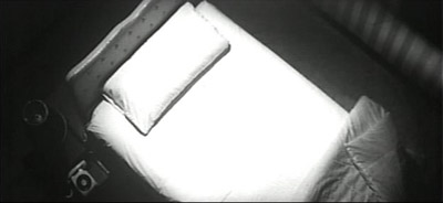
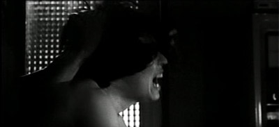
For one thing, Branded To Kill is a fetishist's wet dream. The movie is crawling with people who replace their desire for one thing with something else. Hanada has an obsession with the smell of freshly boiled rice, and is constantly demanding that people prepare rice for him so he can smell it. Suzuki says in an interview on the disc that he thought this would be a good way to show that the killer was Japanese: he doesn't like the smell of steak or hamburgers but of rice. But he takes it for granted that the character would be obsessed with the smell of some type of food. I don't know if that's typically Japanese or not, but it's certainly weird. Hanada is also a fan of non-traditional sex; early in the movie is a five minute sequence of him sleeping with his wife in which variations of this shot:

are intercut with variations of this shot:

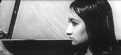
This movie has more sexual positions in that sequence than anything else I've seen except Wild At Heart. With a wife like that, you'd think he wouldn't stray, but he seems to find his wife a little too crazy. So it's no surprise that when he meets a nice, normal girl named Misako, he falls hard for her. They meet cute: he's on the way home after killing six or seven people and his car breaks down. She's driving a convertible with the top down in the rain, and offers him a ride. Here she is, looking as happy as she ever will:

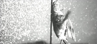
To me, the expression on her face is a warning sign. More worrying is her dashboard ornament:

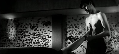
Yes, that's a dead bird with a spike driven through its neck, hanging from her rear-view mirror. Not only does Hanada not get out of the car when he notices this, he can't get her off his mind, and when she shows up offering him a job, he takes it. That's the job he blows, in a pretty literal illustration of the butterfly effect (a butterfly lands on the barrel of his rifle just as he pulls the trigger, causing him to miss). And things go downhill from there. Here's the most tender moment in his relationship with Misako:

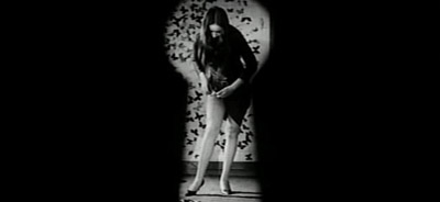
That's Misako's apartment, where the walls are decorated with pinned butterflies. Hanada keeps the gun trained on her while he takes off her shoes, then her stockings. Unfortunately, she gets her hands on the gun then and tries to shoot him. She misses. You would think the (at that point) second-highest ranked Yakuza killer would try to avoid a woman who'd just shot at him, but not Hanada; instead, he watches her put her stockings back on through a keyhole:

So yeah, this film has a kink or two. It's no secret that Japanese sexuality is pretty distinct from the American variety, but I haven't seen many movies that reflect that.

It's a mistake to focus much at all on the relationship between Hanada and Misako, though; this isn't a love story, and it's not what you'd call character-driven. It's also not what you'd call plot-driven; the story is pretty ridiculous. The movie's worth watching almost purely for its style. The stills above give some sense of the sort of late-sixties cool the movie exudes, but they can't convey the experience of Suzuki's truly unique and bizarre cinematic grammar. By grammar I mean the set of conventions he uses to convey information beyond what you see on screen. Everyone's familiar with the Western conventions, even if they don't know it: a slow push into someone's face usually means "this character is making an important decision," a dissolve indicates the passage of time, and so on. Most of these things are understood more or less subliminally, but when you run into a filmmaker who observes none of them, the results can be pretty jarring. I'm not sure if this is unique to him or if it is part of a national style, but I suspect it's just him, since this movie got him fired.

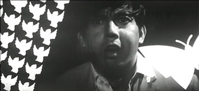
He does have his own set of rules, however, and although it takes multiple viewings to figure them out, it's kind of a fun project. He likes to rotate the camera around a subject in 90 degree increments when they're anguished, for example. He uses non-diagetic sound and shots that are unrelated to the action of a scene to convey subjective impressions. You can see this in the sex scene between Hanada and his wife; although the sudden cuts to shots of Misako make it look like she is watching, the sound of rain from earlier in the movie and the way Hanada covers his wife's face makes it clear that he is imagining he is sleeping with Misako instead of his wife. But for every technique that works, or makes a loopy kind of sense, there's one that doesn't, like mixing cell animation with film for one 20-second sequence, like so:

I'd be inclined to forgive this technique (it's certainly visually striking in a graphic-design kind of way) if it weren't for the fact that he only uses it once in the whole film, and it doesn't really tell us anything that hasn't been established over and over again by that point. I could be mistaken, but it also seemed to me that the last third or so of the movie (after Number One appears) was much less visually interesting, and had a lot of shots that I actively disliked: unmotivated camera moves, shots with peoples' heads cut out of frame, and at least one plot point (Number One seeming to burn his own face with acid in the bathroom for no reason) that I have been trying unsuccessfully to sort out since I saw the movie. I don't think the style is in service of anything throughout the film, and I think the style sort of falls apart towards the end. Without that, there's not much left to enjoy.

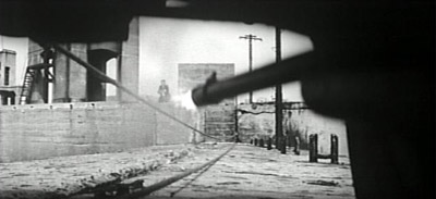
But when it is good, it is very very good, and some of Suzuki's techniques look better now than they would have in 1967. Take this, for example; Hanada is slowly crawling under a car that he's pulling forward as he moves toward some gunmen:

In the shot above, which is quite long and moves forward with the car, Seijun Suzuki has just invented the first-person shooter. I also loved the sequence where Hanada kills four diamond smugglers: the diamonds are being smuggled inside of glass eyes. Glass eyes that are being worn at the time. Anyway. This movie is a bit of work to decipher, but it's interesting. I'm curious to find out the extent to which Suzuki's techniques were picked up by other Japanese directors. And if you want an introduction to a kind of movie you've never seen before, you could do worse than to rent this. Until there's a Criterion edition of S.P.Q.R., of course.